Quantifying the Unquantifiable - How Do You Know When You Need To Improve Performance

Improving performance is a never-ending task, and deciding whether it should be prioritized over adding new features can pose a challenge even to the best of us. On one hand, users do not want to use a tool that feels slow; on the other hand, they definitely won’t use a tool that does not have the necessary features. That’s why there should be a balance between improving performance and innovation. Furthermore, performance is not the easiest metric to quantify: You can measure aspects of it, but it often comes down to how performant the tool “feels” to a user.
By combining existing and generating new performance metrics, we have developed an unorthodox methodology to quantify our load time and determine if we need to invest in performance.
Improving What You Can’t Measure
Originally, we didn't have analytics related to performance integrated, and were therefore primarily tracking performance manually. The first, obvious step then was to add analytics so we could automatically track performance metrics, and creating dashboards to track these analytics over time. Specifically, we broke the analytics down into different stages to isolate what exactly was taking the longest, which would help us formulate solutions.
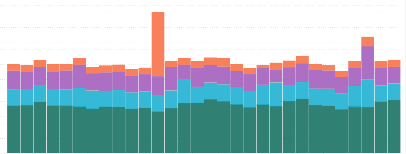
Load Time Broken Down by Segment to Highlight Areas of Focus
However, there were quite a few problems with the analytics. First off, the legacy tools didn’t offer similar analytics, meaning that we were not able to compare apples to apples and still had to resort to stopwatch timing. Furthermore, for various reasons, it is not possible to add analytics to performance aspects like “smoothness”, meaning we were still left with a nebulous, non-quantifiable “how does it feel?” rather than with a solid metric. So even with our instrumentation to observe and quantify performance, we were still stuck with the original question: How fast is “fast enough”? We were measuring something; we had the metrics, yet we had no quantifiable objective to achieve user acceptance.
We needed this baseline to know how much investment we needed to make in performance: If we were close and we only needed small, incremental improvements, we could probably iterate our way into it. However, if drastic changes were needed, we may have to rethink our entire technology stack or approach.
Qualitative, Not Quantitative
To quantify acceptable load time, we had to get creative. We decided to perform a study with actual customers as participants to establish baseline satisfaction scores. In particular, we were looking to:
- Understand the user’s expectations regarding performance;
- Establish a baseline time acceptable to the user;
- Decide when to address load time.
To accomplish this, we designed a research plan where 20 to 30 participants from North America, the Asia-Pacific region (APAC), Europe, the Middle East, and Africa (EMEA) would record themselves conducting real-world tasks similar to what customers would face using our tool, on a variety of tools available today within Procore. After each task, they would rate the current tool as ‘Much faster than expected’, ‘Faster than expected’, ‘Neither fast nor slow’, ‘Slower than expected’, or ‘Much slower than expected’. They would also rate their performance against competitors in the space.
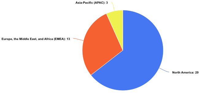
Testers were recruited from various regions
This would not only establish a general guideline for user expectations around performance but having them try several different tools would give us a spectrum of such expectations. If, for example, the user rated our tool as meeting their expectations or faster, we would know that we have achieved at least the minimum acceptable performance. If they rated one tool as ‘faster than expected’ and another as ‘slower than expected’, we could infer that the “acceptable” load time was somewhere between the load time of each tool. This way, we could turn these qualitative assessments into quantitative numbers we could measure against.
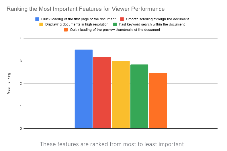
Given that the users were distributed across geolocations, we expected to also be able to assess whether or not physical location played into the perception of performance. Finally, we asked the users questions about the relative importance of various aspects of performance to prioritize areas for improvement.
On top of all of the data gathered, the users recorded videos of themselves during these interactions so that we had their expressions of thoughts and feelings, which were invaluable for us to gauge where we were at in terms of our solution.
Outcomes
Armed with the results of the study, we were able to:
- Better understand what users expect in terms of performance;
- Establish a quantitative measure to aim for when evaluating the performance of our solution;
- Decide whether we need to take action to improve performance (and because of 1 and 2, we were able to assess just how much we needed to improve!)
The Nielsen Norman Group’s research suggests that 10 seconds is the cut-off time for web page interactivity, after which customers won’t accept your solution. However, in watching the hours of recordings from this study, we learned it took less than 10 seconds for users to get discouraged (for instance, to close the tool). We were, therefore, able to get a more accurate estimate of what our users in our particular product space were looking for.
Additionally, we created a new analytics dashboard that allowed us to match analytics to the user-provided videos. This increased our confidence that these analytics were really measuring the load times the users were seeing. We were also able to rule out a few concerns, such as load times not correlating with the user's physical location, so we didn’t need to worry about zone issues. In conjunction, we also took a very detailed look at the analytics, down to the user and interaction level, which allowed us to validate assumptions about what exactly was slow. It turned out the complexity of the data is the critical path for speed and not, as we originally assumed, the data size.
Armed with this knowledge and prioritized feature list, we were able to isolate individual areas on which we would focus our efforts and brainstormed how to meet the performance goals outlined above. We were able to develop an iterative plan that allowed us to retain our technical approach.
And finally, by continuously collecting performance metrics, we can ensure that we are staying on top of performance going forward, balancing the priority of meeting the user expectations with adding new features.
Summary
In this article, we described an approach to quantify performance using a qualitative approach, allowing us to make data-based decisions about where to invest our engineering resources. The lessons learned will allow us to successfully balance the priorities of improving existing performance with adding new features, delivering the maximum value to the customer.
If using outside-the-box techniques to maximize customer satisfaction excites you, then join our team at Procore!